Sometimes backwards is the way forwards.
When times get hard, there is often comfort to be found looking back to former glories. Certainly that seems to be story behind three of this year’s big rebrands.
The Co-op, Natwest and Kodak have launched refreshed identities that look to consolidate past heavyweight status after recent challenging periods that were in danger of turning them into deadweights.
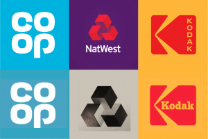
Top Row: 2016
Bottom Row: 1968, 1968, 1971
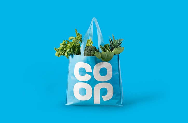
Co-op in particular are deliberately attempting to “evoke[s] nostalgic memories of local shops and dividend stamps”. Harking back to simpler times, they are asking you to forget recent banking scandals that have tarnished the forgettable mixed-weight, navy blue marque and remember the glory days of the high street – when Co-op and it’s icy-clue clover dominated and it was Brentry, not Brexit, that was looming.
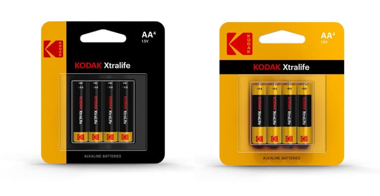
Likewise Kodak’s golden years, when it dominated the camera market, seem like ancient history. Having been all but forgotten in the era of smart phones and Instagram, reclaiming 1971’s red and yellow K looks like a smart way of reasserting a strong heritage – especially when tied with a launch of retro-inspired products that straddle the digital/analogue line.
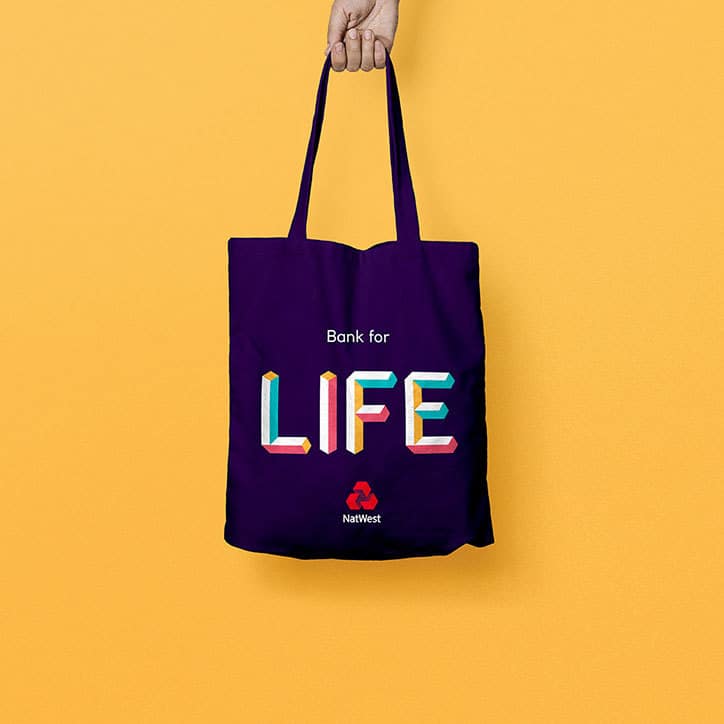
Natwest’s call-back to 1968 is subtler in some respects – the Natwest logo has never been far removed from its original conception of three interlinking blocks representing three merging banks. An odd move, perhaps, as the three separate banks is no longer particularly relevant to its current story. Nevertheless, it does enable a far more interesting development in its broader storytelling and brand language with colourful, playful blocky illustrations trying to break the mould of the more staid traditional banking imagery.

This does, of course, rely on people having positive memories and associations with the time and its identity. And while there have been dissenting voices, it seems to be doing some good for Co-op. Earlier this week, they were rewarded for Outstanding Achievement at the Retailer Industry Awards, after a major shakeup crowned by rising sales and the successful relaunch.
Further more, simple, flat logos like Co-op’s and Kodak’s work well in the digital age, the limitations of print in the sixties and seventies giving way to the need for scalable, vector-based artwork that can sit comfortable across digital and physical platforms.
This could suggest, therefore, that nostalgia is trending once more – not that it ever really goes away.
Then again, judging from these examples it might just be more cases of “when things get hard, just stop, reset and relaunch from the last ‘save point’.”
Explore our latest thinking on brand strategy, customer experience, digital transformation and the trends shaping today's industries. From emerging technologies and changing customer expectations to destination branding, aviation and financial services, our insights share practical perspectives to help organisations build stronger brands and make better strategic decisions.